The STXBP1 Brand Gets a Fresh Update

You are looking at a very exciting update from the STXBP1 Foundation.
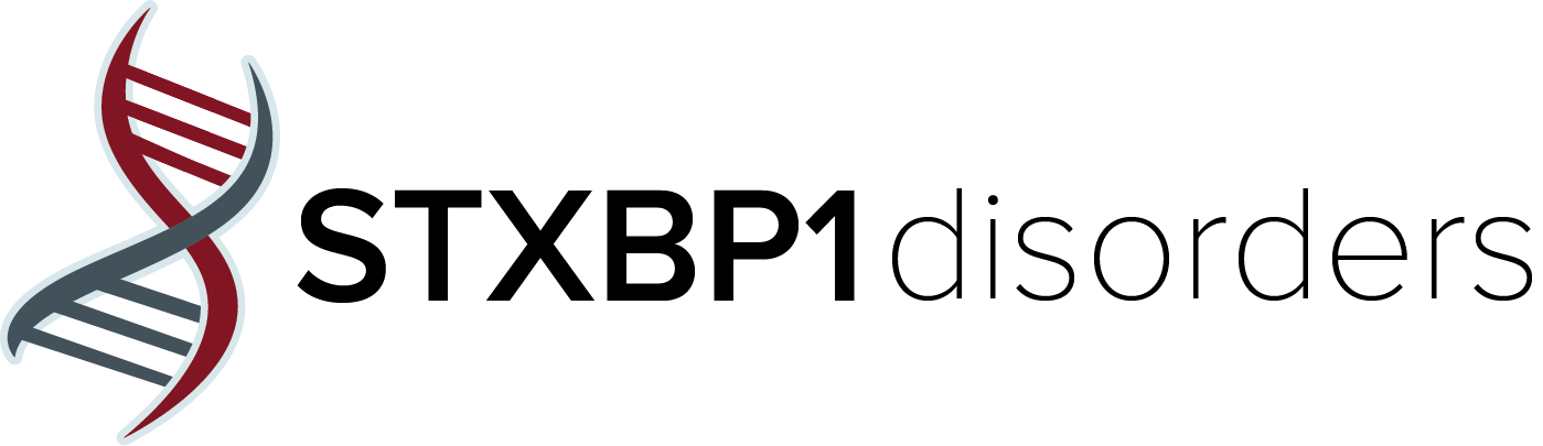
As the STXBP1 disorders community has grown dramatically over the past few years, we are determined and eager to grow just as fast with it. We are currently evolving our brand strategy to better drive consistency and coherence across all our marketing and communications with an update to our identity. You’ll notice a subtle difference to our logo design that makes our name easier to read and you’ll see that we’ve added in secondary colors to make the creation of promotional materials more flexible and impactful.
As you review our new Style Guide, you’ll see the objectives we set and the design rationale we chose for this identity update:
preserve our strong brand equity with better highlighting of the organic shaped helix logo
improve legibility with a stronger and easier to read typography and primary logo treatment
differentiate our naming architecture for flexible use cases between the foundation and the disorder
introduce a new tagline with proven messaging that is already familiar and revered
showcase our primary colors more prominently as a recognizable anchor to our history
We purposely chose a measured approach to this update with the intent to maintain and build from the STXBP1 Disorders brand familiarity and uniqueness which is already firmly established within the rare disease community and medical industry.
Please visit this new branding page and read the brief STXBP1 Style Guide. You’ll also find any file you might need when using our logo. We are all ambassadors of the STXBP1 Disorders brand and we need your help to assure a solid alignment across all our activities with this update.
Thanks for growing with us on this journey to find a cure.
Russ Novy